You might have the technical know-how but do you know the rules for composing an image with maximum impact?
In this episode, Gina and Valerie discuss the top 11 rules you need to consider when you are composing an image. There’s much more to composing than just the Rule of Thirds. You’ll discover what you need to know about the Fibonacci sequence, how to get the right balance, why odd numbers are great – and much more.
#ginachallenge #rules
Click play to listen to the podcast or find it on iTunes here. If you don’t use iTunes you can get the feed here, or listen to us on Stitcher radio.
Show notes
Shoutouts
Bryan Turner
“I was tinkering around with this photo from last summer of my wife and daughter when I applied Gina Milicia’s chocolate preset. I think it gave it a pretty cool look. Thanks Gina!”
Listener Questions
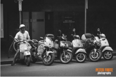
From Peter Foote:
“Just wondering if others edit street photography to remove distractions? This frame had a woman and part of a man entering from the right and drew too much attention so I cloned them out.”
Gina’s feedback is in the episode.
Listener question from Melanie Young:
“I am a complete amateur and would like some feedback. What can I do to make this photo better? I was really focusing on skin tones. There has been little touching up in the editing process. I appreciate the help!”
Feedback from Gina is in the episode.

TicTacToe: How to compose an image for maximum impact
Why are some photos stronger than others? Subject, light and post production are really important but if the composition is off it doesn’t matter if you’ve just photographed the best sunset in the world, the image won’t work as well as one that’s well composed.
The rules of composition are mostly inherited from the art world and these rules or guides are based on mathematical formulas first discovered thousands of years ago.
When photography was invented a few hundred years later it made sense to also apply these rules or guides to photography.
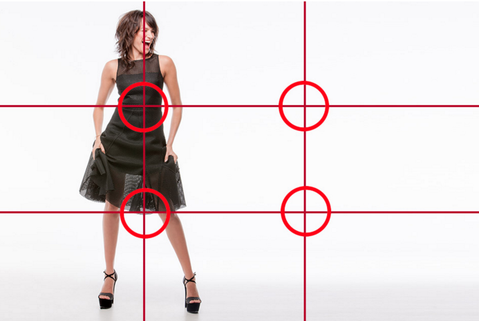
1.Tic Tac Toe Rule (AKA The rule of thirds)
- Creates movement and life in an image
- Forces the viewer’s eye to move around the image
- Ideal for editorial layouts because smacking an image dead centre means it will end up in the gutter of the publication
- Pretend your photo has a tic tac toe board on it.
- Keep the main subject in the bits along those lines or where the lines intersect (I call them hotspots)
- Landscape horizon line should be on one of those lines

When is it ok to break the rule of thirds?
- If you are shooting something with a very shallow depth of field it automatically stands out
- If an image is symmetrical like photographing a beautiful face or building like the Taj Mahal.
- There may be other factors at play like leading lines.
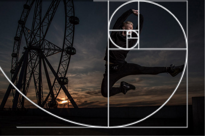
2. The Bunny Rule (AKA the Fibonacci sequence or Golden mean)
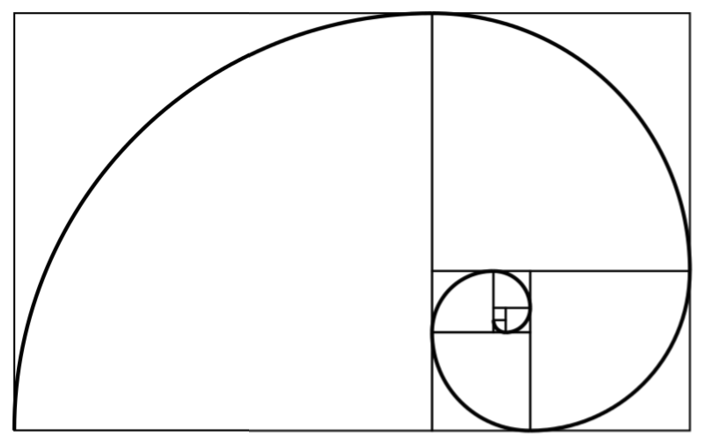
Get your own free Fibonacci template here
There was this guy called Leonardo Fibonacci who discovered this mathematical formula based on being curious about rabbits doing what rabbits do. He wanted to know how many rabbits would be born if 2 rabbits “did what they do”.
After 1 month 2 pairs
After 2 months 3 pairs
After 3 months 5 pairs
After 4 months 8 pairs
After 5 months 13 pairs
After 6 months 21 pairs
1 1 2 3 5 8 13 21
Later it was discovered that this sequence is also repeated in clouds, the way branches grow, shells and some of the most beautiful architecture and art in the world.
In photography and art if you divide an image according to his mathematical formula
1 +1 +2 +3 +5+ 8 and place the important part of your image in the smallest square you will have a visually pleasing image.
Everything beautiful in nature follows a 1:1.618
- A beautiful face the width of the mouth is exactly 1.618 as wide as the nose
- Front teeth are exactly 1.618 as wide as second teeth
- Length of feet to belly button is 1.618 as big as the rest of the body
- Many retouchers apply these formulas when “tweaking” a face or body they are retouching
- Many landscape photographers believe it is better than the rule of thirds because it replicates nature.
- In a portrait if you place the most important part of the image where the smallest square is your image will look more dynamic.
Download the Fibonacci template and overlay it on your images and tweak the cropping and see how the shot looks.
Once you are aware of this formula you will start to notice it everywhere
3. The rule of odd numbers
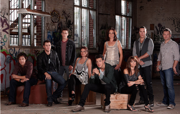
FYI if you’re wondering what the guy who voices show opening and closing looks like that’s him on the far left of this image. His name is Samuel Johnson and he is an awesome actor and an amazing guy!
Photographing groups of items in odd numbers works better in a composition than even numbers because the human eye is more comfortable looking at odd numbers of groups
3 vases in a row looks better than two or 4
3 people in a group is more dynamic than two or 5 rather than 6
4. Balance
- An image that’s balanced might have something in the foreground that is the hero balanced out with something in the background or vice versa.
- If the shot only had something in the foreground the shot looks too heavy on one side
- So if you had a person filling the side of your frame using the rule of thirds or bunny rule you might want to try and balance the image out by including something smaller and less significant in the background to lead your eye through the frame.
5. Breathing space
Cropping an image too tightly is going to make the image feel constricted. leaving space around the image looks more comfortable because you’ve given the image space to breath.
6. Movement
- The way a portrait is posed can also direct the viewer’s eyes through an image.
- If your model is looking away from camera try and leave some space for them to look into.
7. Angle of view
- Birds eye
- Worms eye
- Child from slightly below vs above
- Model from slightly below vs above
8. Background clutter
- What’s the hero of the shot
- Use depth of field to remove background clutter
- Look for clean backgrounds to simplify an image
- Does this background improve or detract from the hero of my shot?
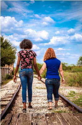
9. Leading lines
A great composition has elements that lead the viewer’s eye through the photo:
- railway lines
- roads
- the curve of a river
- edges of a building
- laneways
10. Depth or layering
You can create depth in an image by creating a foreground, middle and background
11. Framing
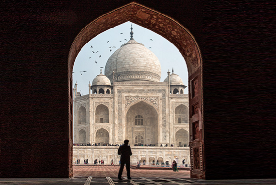
Other framing ideas:
- trees in the foreground of a landscape
- doorway to frame a portrait
This helps to isolate the hero of the shot and draw the eye to the area that is the hero of the shot.
#ginachallenge #rules