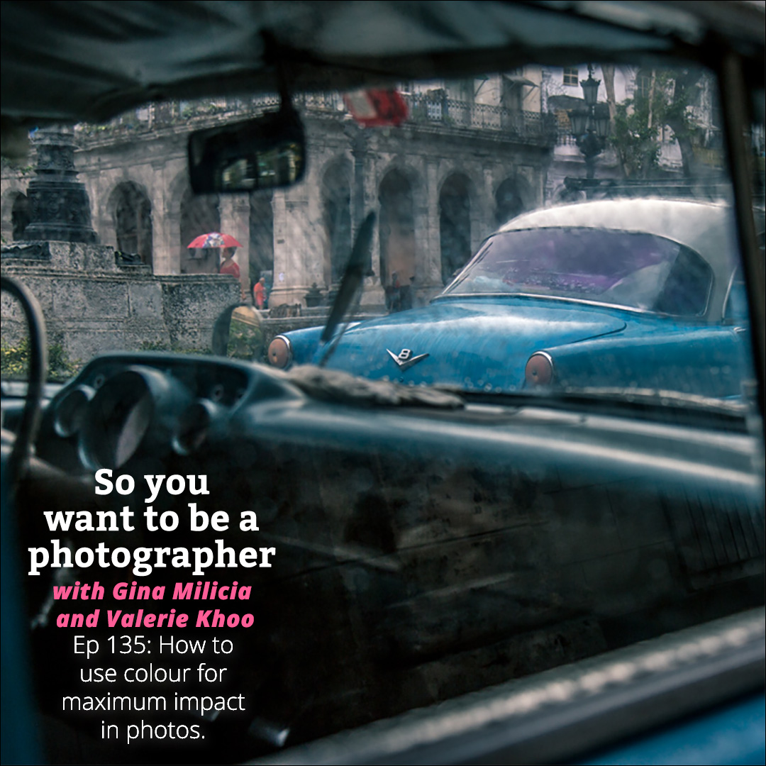
Choosing the right colour in your photographs isn’t just about wardrobe choice. You should also consider how the overall colour palette impacts your image, and also whether you can adjust any hues in post-production to achieve a show-stopping look.
Gina and Valerie chat about what you need to be aware of, the importance of a colour wheel, ideal colour combinations for any situation, and much more.
Hope you enjoy the podcast.
Sign up to the newsletter for great tips and free Lightroom presets.
Join the dynamic Gold Membership in our Community which delivers monthly tutorials, live mastermind and lots of behind the scenes videos into the creative process.
#ginachallenge #colour
Click play to listen to the podcast or find it on iTunes here. If you don’t use iTunes you can get the feed here, or listen to us on Stitcher radio.
Show notes
Listener Question
Colours are the mother tongue of the subconscious – Carl Jung
Blue
- Clam
- Peaceful
- Serene
Red
- Passion, desire, and love.
- Hunger
- Danger, attention
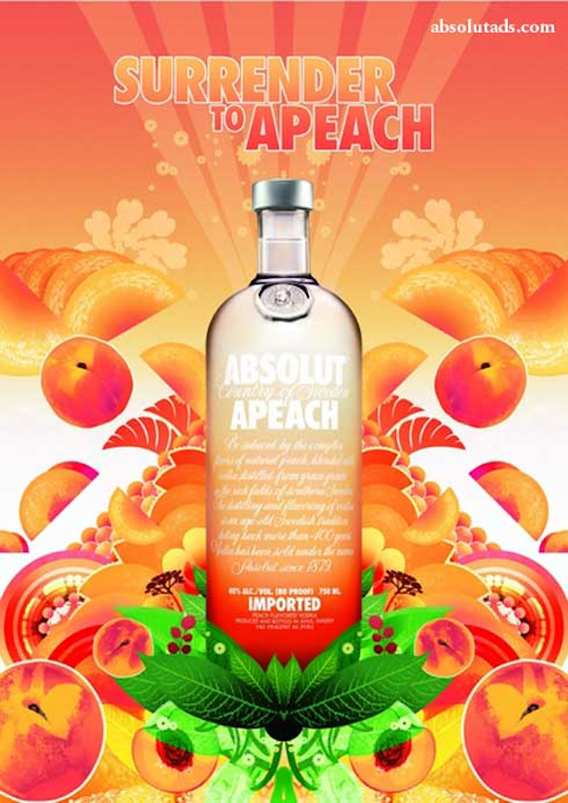
Orange
- Joy
- Enthusiasm, fascination, happiness, creativity, determination, attraction, success,
encouragement, and stimulation. - Caution
Yellow
- Sunshine, joy, happiness, intellect, and energy.
- Warmth
- Stands out from the crowd
- Babies cry more in yellow rooms.
- Cowards are yellow
- Sickness
Green
- Peaceful
- Go
- Money
- Healing, health
- Water
- Calm
Purple
- Royalty. Power
- Wealth and extravagance.
- Wisdom, dignity, independence, creativity, mystery, and magic.
- Prince
White
- Light, purity, good
- Perfection.
- Cleanliness.
- Positive
Black
- Power, elegance, formality, death, evil, and mystery.
- In the black
- Fear
- Negative
- Evil
- Grief.
How can we use colour in our photography
Saturation and brightness
- The saturation and colour used in an image plays a huge impact on the vibe of the image
- Over saturation of images tends to give the image a fake look
- Water in an image looks too blue or eyes too blue, lips too red
- Desaturated images can create a bleak vibe to an image
- In the movie Up: Intro image are bright and poppy. Ending is bleak and desaturated
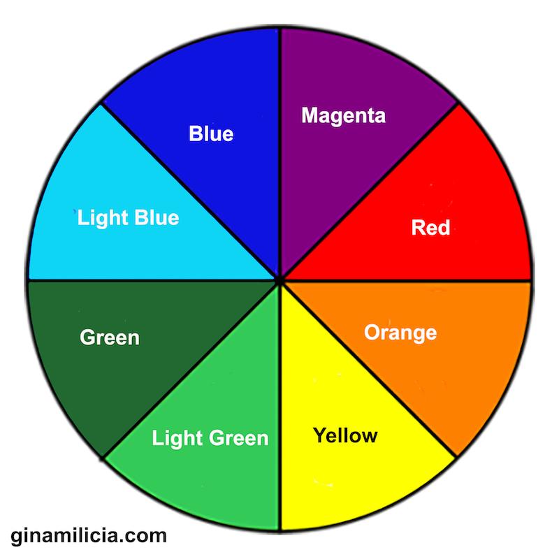
- Colour Schemes or ways that colours look good together
Monochromatic
- Monochromatic colour schemes are created from a single base colour and extended using its shades, tones and tints.
- The colour can be extended by adding whites (lighter) or blacks( darker)
- Black and white is the most obvious use of monochromatic colour scheme but it also works with colours to create a mood.
- Forces viewer to focus on the details of the image

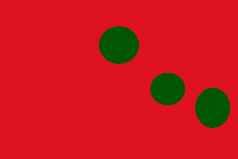
Complementary colours
- Colour becomes more obvious using contrast
- To increase contrast choose colours that are opposite each other on the colour wheel.
- Using colours that are opposite each other on the colour wheel are called complementary colours.
- They just look better together
- As a general rule try and use the weaker colour in the majority of the shot to create a more visually pleasing image


If you are ever in doubt ask WWMND? What would mother nature do?
- Blue sky =big yellow sun=small. Blue is the dominant colour
- Berries small. Berry bush is large
The use of contrasting colours is popular in advertising, tv and movies


Take this theory a step further and use it to colour images
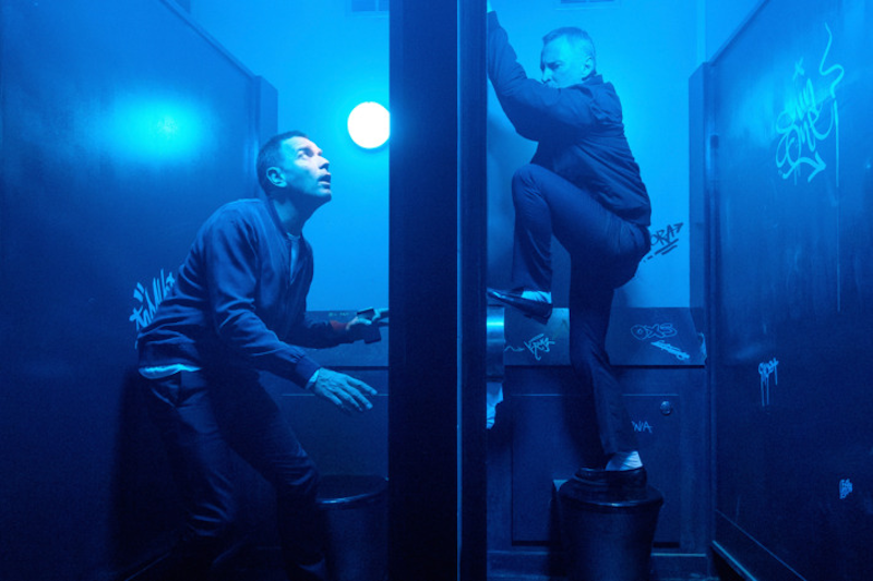
Colour grading
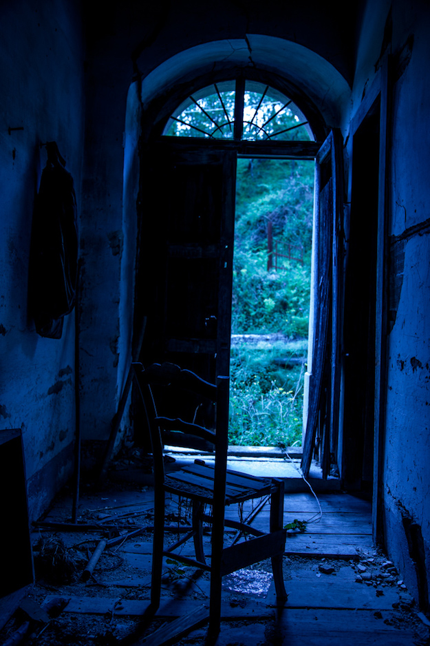
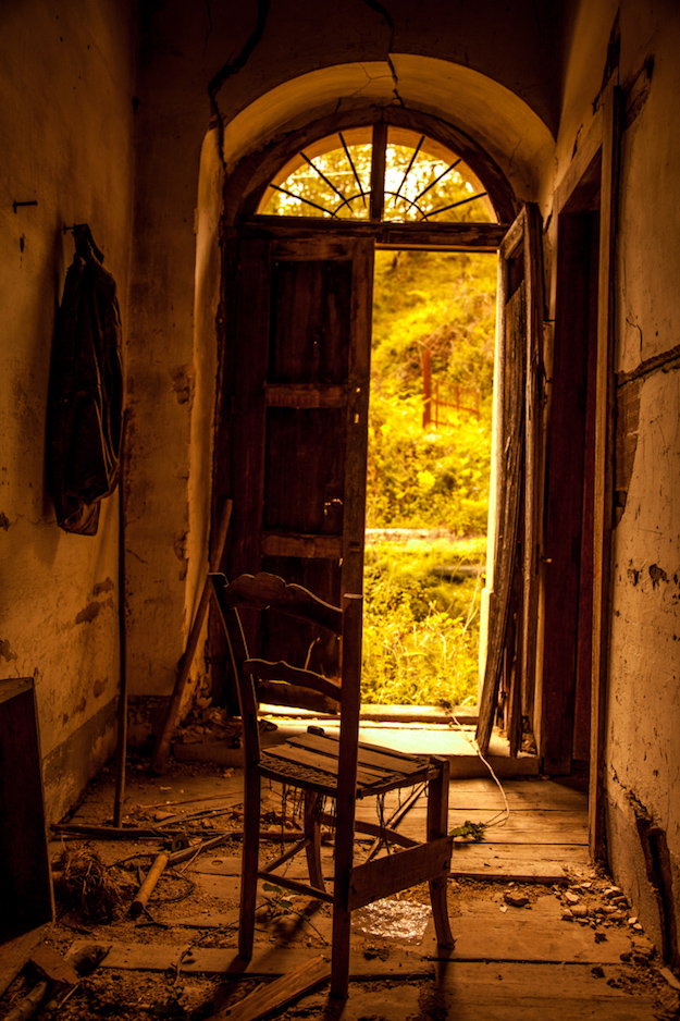
Blue in shadows and orange in highlights is a colour grading used in many Hollywood blockbusters


These looks can be recreated in post production using lightroom, photoshop, capture one etc
Receding vs advancing colours
Warm colours (red/violet, red, red/orange, orange, yellow/orange, yellow) are advancing colours – dominant colours, stand out or advance in the frame
Cool colours (green, blue/green, blue, blue/violet) are receding colours – they recede or go back in the frame
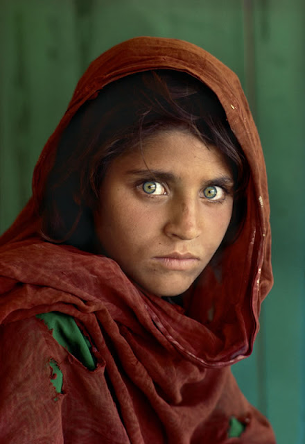
A person wearing warm tones against a cool background makes such a powerful portrait.
Be aware of this when shooting. If you don’t want to detract from your subject avoid having something warm toned in the frame
Analogous Colours
- Analogous colours are groups of three colours that are next to each other on the colour wheel
- One colour is dominant throughout the image
- One is supporting role
- Third as well as blacks and whites is the accent colour

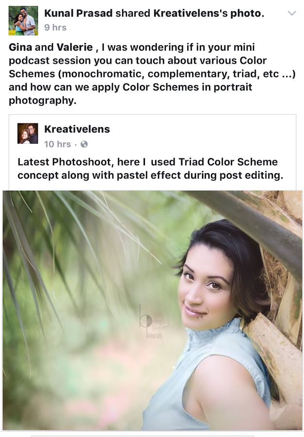
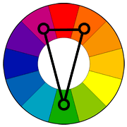
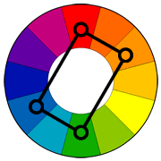
Triadic Colour Scheme
Most famous example is Burger King Logo

Triadic colours are three colors arranged evenly spaced around the colour wheel.
- Trickiest to pull off
- Playful look
- Often used in cartoons
- Not just primary colours
Split-Complementary Colour Scheme
Similar to complementary colours
The split-complementary colour scheme is a variation of the complementary colour scheme. In addition to the base colour, it uses the two colours next to its complement.
This colour scheme has the same strong visual contrast as the complementary colour scheme, but has less tension
Tetradic Colour Scheme or double complementary
- Double complementary scheme doubled
- Two pairs of opposing colours.
- Use weaker colour more with splashes of brighter colours.
Warm vs cool colours
The look and feel of an image can be drastically changed by the colour tone


#ginachallenge #colour