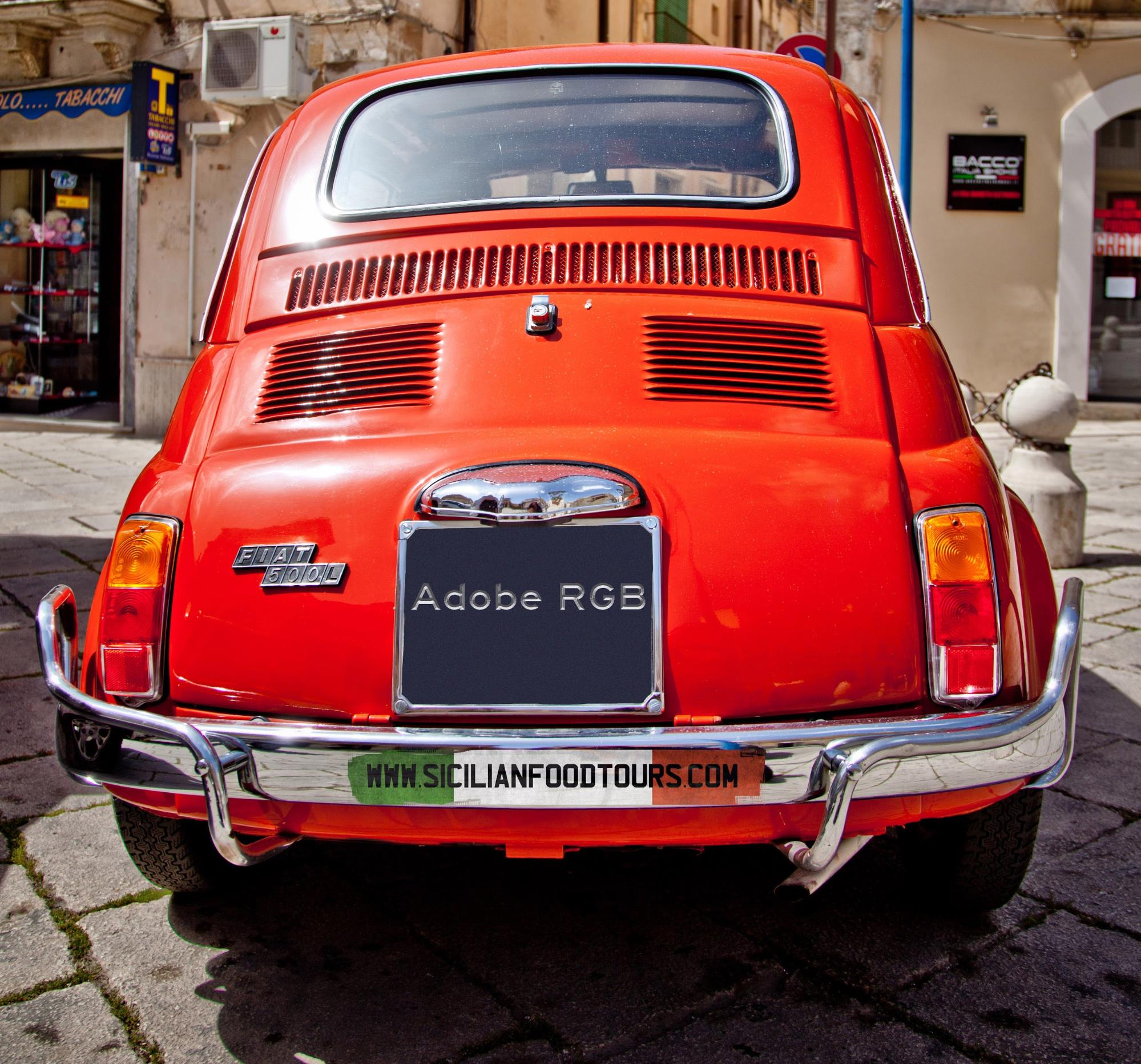
In an ideal world, I could photograph a man wearing a blue suit and a yellow cap, sitting in a red Fiat 500 (the coolest car ever made). I could use any camera, process it using any RAW file software, retouch on any computer and print it on any printer. The reds, blues, yellows and skin tones would be identical through the entire process.
Sadly, we don’t live in that world. Cameras, monitors, software and printers speak different languages and see different versions of colours.
This makes what should be the relatively simple exercise of photographing, post-processing and printing one of the most frustrating exercises possible.
The good news there is a workaround. It’s a bit like a language interpreting service for colours. Introducing: colour management.
Colour management, like the UN, gives all your devices consistent colour profiles (the way they see colour). The gorgeous red Fiat 500 I photographed will have exactly the same red tone in the digital file, the post-processed final file and the printed version.
Colour management in camera
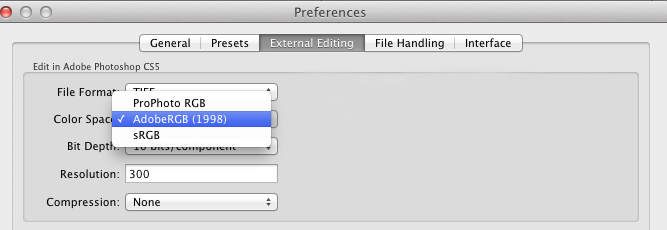
Raw files don’t have a colour profile in them, the profile is added once the image is exported from RAW editing software like Capture One or Lightroom. If you have not selected a colour profile, your file will be exported using the software’s default setting.
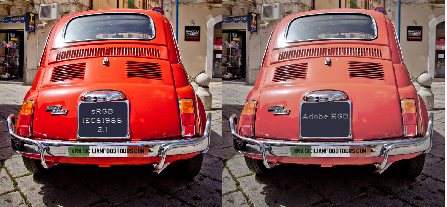
If you are just posting images online (on a website or on social media) convert images to sRGB because your images will look great on all screens.
If you are sending your images to clients, then set your colour profile to Adobe RGB (1998) because this is the king of profiles. It has a wider range than the other option, sRGB, and is the industry standard.
Adobe RGB was invented by Adobe in the late 90’s and although it was never their intention, was adopted as the industry standard.
TIP: Send proofs out with sRGB profile because they look best viewed on every device including smart phones, laptops and tablets.
Printing
Printers like to feel special too so they also have their own colour profiles and these can vary quite a lot depending on the printer.
I will admit to throwing several printers out of the window when they’ve run out of ink during an extremely stressful moment. I know they do it on purpose.
When I need to print my files, I send them to a professional printing lab, who will give me a colour profile to convert my images to before they print them. I then adjust my images based on how they look with the lab’s colour profile. 98 per cent of the time they will get the exact same print as the image on the screen.